UX Design in Hospitals
The HighMed Cockpit: UX Design for Hospital Terminals
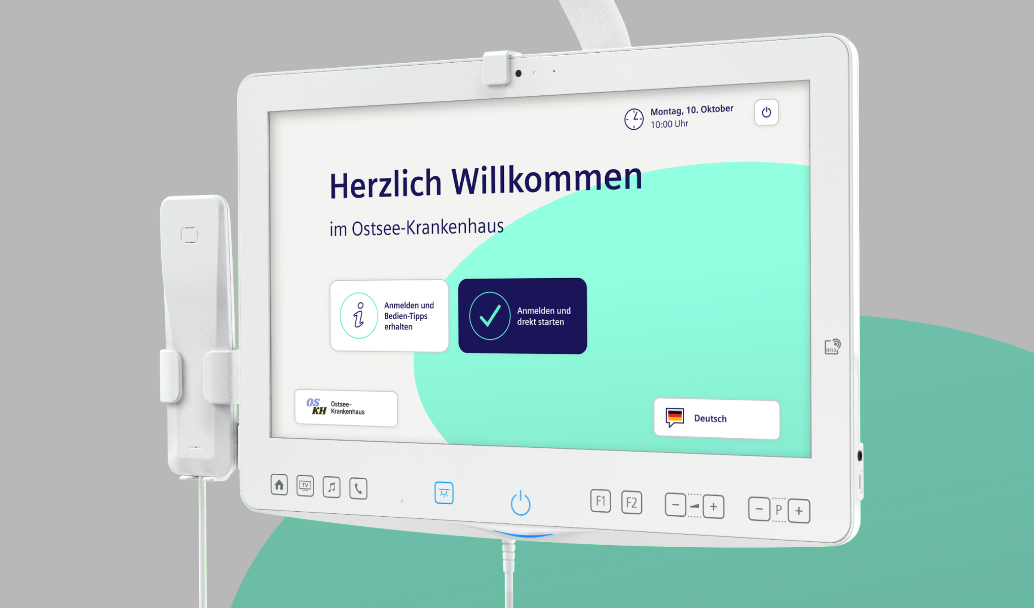
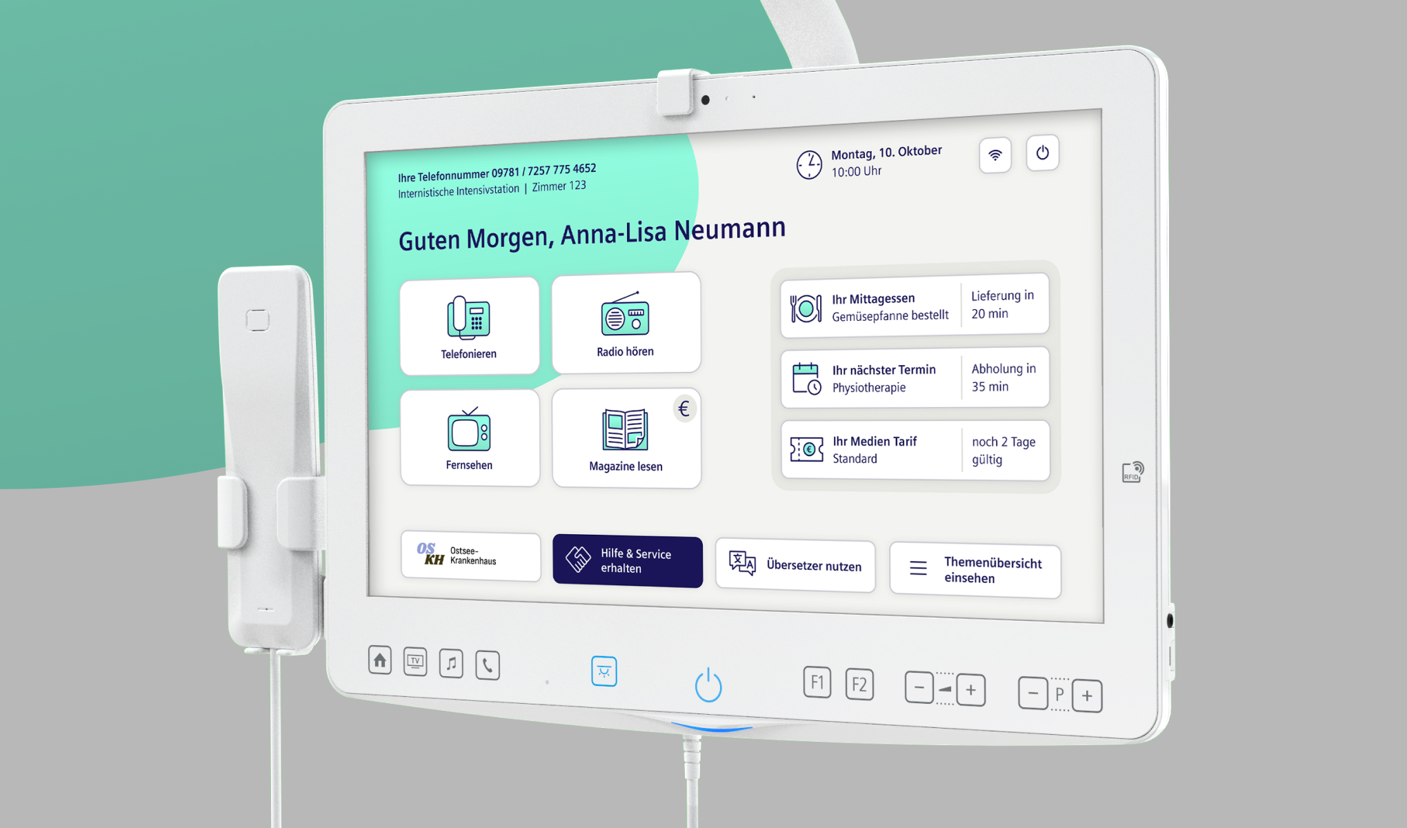
In collaboration with Siemens HiMed, we are developing the next generation of the Cockpit – the multimedia terminal located directly at the patient’s bedside. Our goal: an intuitive, accessible, and human-centred user experience that supports all patient groups – regardless of age or individual impairments. It’s reduced to the essentials so as not to overwhelm people in need of recovery. The ergonomic touchscreen of the hospital cockpit provides modern digital services at the bedside for patients.
What the Cockpit Offers: Accessible Interface Design in Healthcare
The ergonomic touchscreen with hardware buttons offers everything that makes a hospital stay more pleasant:
- Entertainment and communication
- Information about appointments, meals, and important events
- Service requests and assistance directly from the bedside
Accessible Interface Design for Healthcare Settings
Our UX concepts are based on extensive user research and practical testing – including with older people and those with physical or cognitive impairments. The colour design of the HMI was chosen to ensure content remains easily recognisable and accessible, even for people with various visual impairments or colour blindness.
UX for All: Supporting Users with Impairments
Special attention was given to the following aspects:
- Accessibility: e.g. AAA-compliant contrasts, large font sizes, colour choices suitable for visual impairments
- Clear UX writing: e.g. unambiguous phrasing, direct address, word choice optimised for older target groups
- Usability: e.g. large buttons, ergonomic placement, reduced content for better overview
- Friendliness and recognisability: e.g. illustrative, clear graphics, customisable colours matching the clinic’s design, friendly tone of voice
Design with orientation and feeling: Visual Calm in Clinical Environments
The new UI conveys calm and structure. A coloured ellipse in the background acts like a spotlight: it directs the focus to key actions and functions, helping to make quick and safe decisions – without overwhelming the user. At the same time, it ensures that different screens are easily distinguishable at a glance – despite a consistent style and identical layout grid. This creates a visual guide system that provides orientation and simplifies operation for everyone. The dashboard is clearly structured and speaks directly to the user: showing the time, location, and key upcoming events. The main functions are always easily accessible.
Developed with Siemens HiMed: Real User Feedback in Focus
We are pleased that the new concept received such positive feedback at DMEA. Now, we are finalising the cockpit – with great focus and with the real user perspective at the forefront.