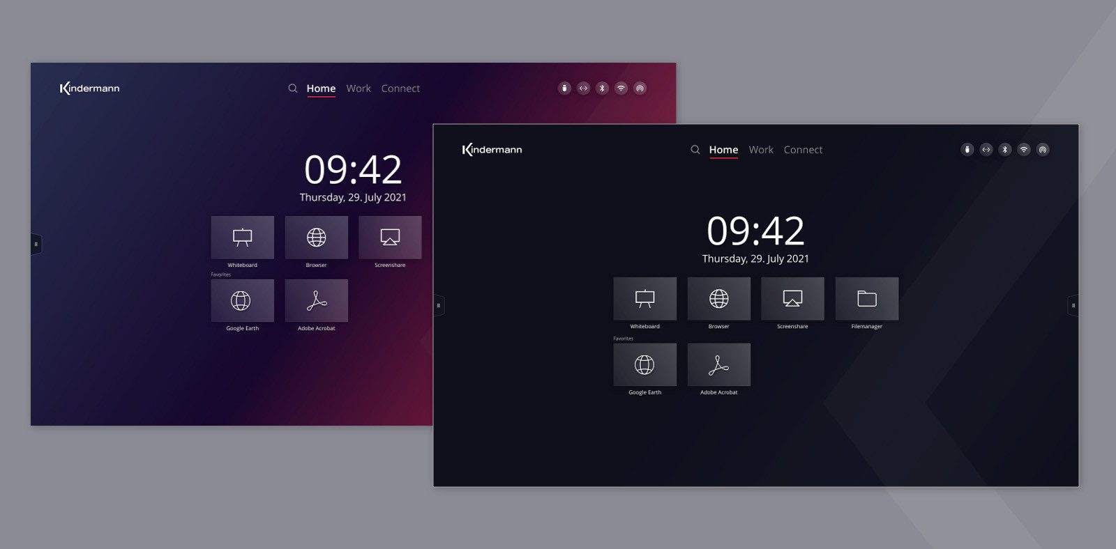
UX/UI design for the Kindermann touch displays

Kindermann touch displays are used in offices and schools. They are deployed where users want to present interactively or work together with others on a digital whiteboard. We created an intuitive and high-quality user interface design for the new generation of touch displays. We managed the project from the analysis of the user groups and usage environment, the competitive research to the support of the implementation. Thanks to the agile way of working, we were able to achieve optimal results quickly.

The developed UI design and UX patterns are transferable to the entire display series. Because one goal of the project was to define an attractive and recognisable UI style for all Kindermann digital products.

Publication
CLIENT
Kindermann
INDUSTRY
Electronics
DISCIPLINE
UX DESIGN

UX Design

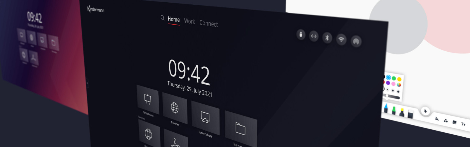
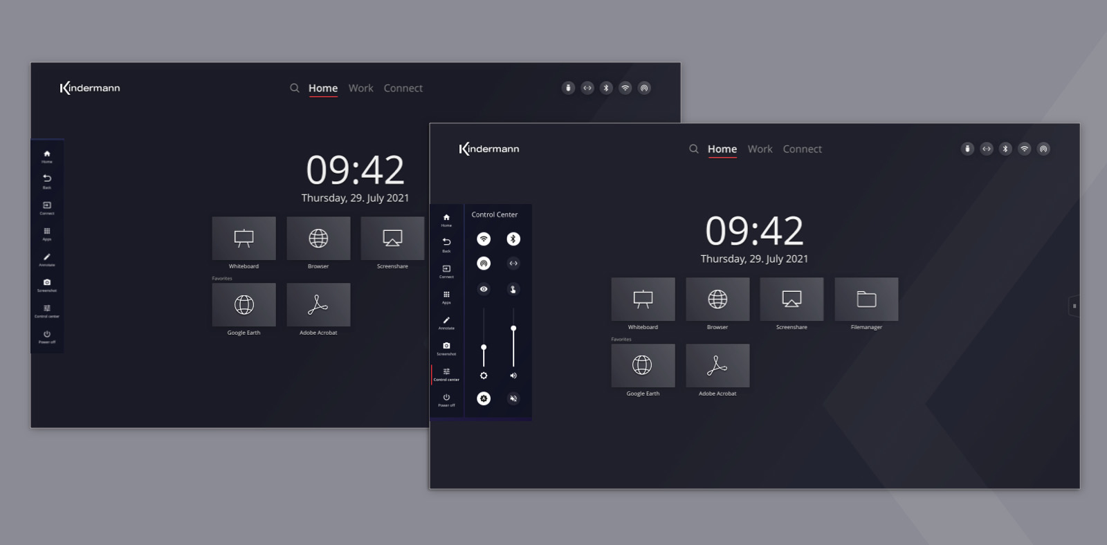
When we developed the user interface, we placed special emphasis on ergonomics. The Kindermann displays are up to 86 inches tall. When operators stand in front of the displays, they have a limited field of vision or a large area in front of them on which to interact. Therefore, it was important to us to arrange controls clearly and ergonomically, and we made sure that menus could be accessed from both sides.

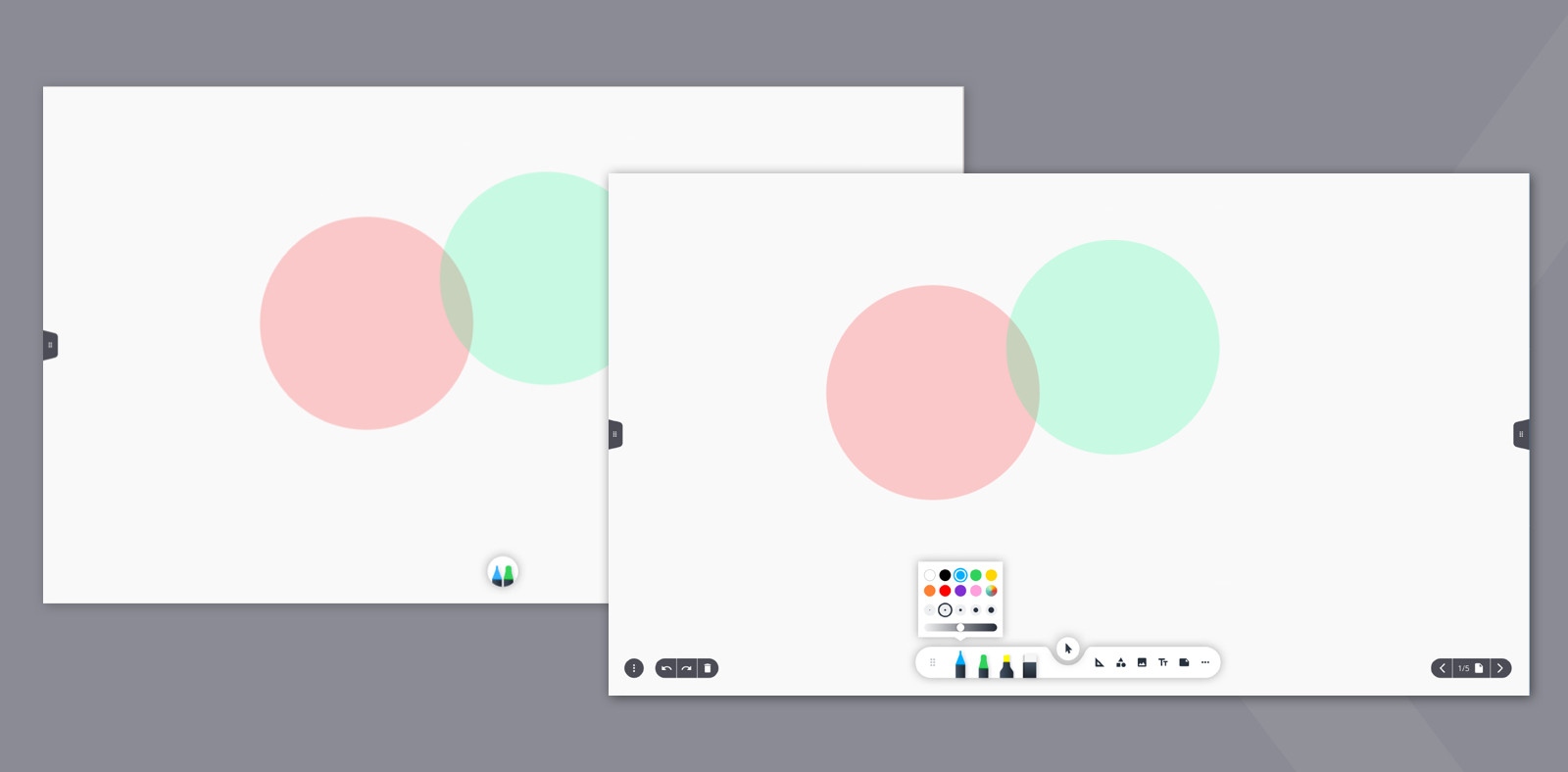
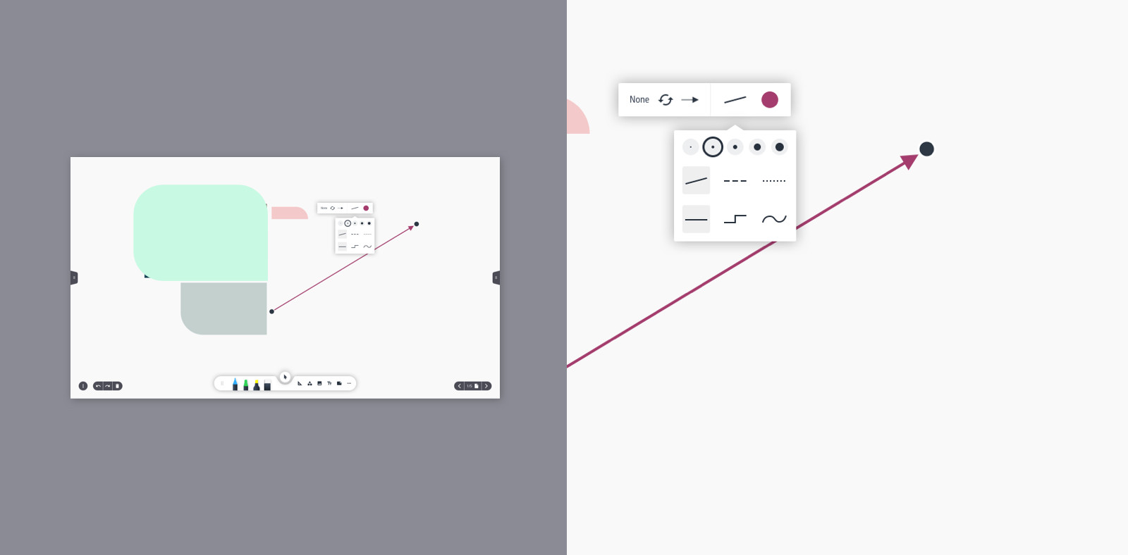
We positioned important information on the top edge of the display so that it is not obscured. To make users feel comfortable from the first use, we chose familiar icon methapers and interaction patterns. For the new whiteboard app, for example, we developed a toolbar that makes drawing and layout tools intuitively usable.

Branding and UI Design

Content creation is the main focus when using Kindermann touch displays. We developed a minimalistic and high-quality style that allows users to concentrate on sketches and ideas. The specially developed icon set underlines the impression. The new brand UI gives the quality promise of the Kindermann brand a visual equivalent. The style presents corporate design elements such as the logo and the company colour red in a concise yet discreet way.

The home screen is an important area for positioning the brand. We designed a wallpaper in a noble dark and a modern coloured version. Both versions feature the Kindermann "K" as an icon and brand mark. The new UI design thus paves the way for all future digital products from Kindermann.

Would you like to learn more about the project?

Tom Cadera

  • Management
  • UX & Usability Engineering
  • User Interface Design
  • Industrial Design

0931 460 66 0

cadera bei caderadesign punkt de