Comprehensive user experience for the robotic caterer from QUBE Munich

Robotics is increasingly finding its way into our everyday lives. It also provides support in the food and service sector, where complex tasks and high availability come together. The robotic caterer from QUBE Munich makes Italian coffee, organic ice cream and cold drinks available 24 hours a day.

We were responsible for both the UX and the industrial design for this innovative robotics project. Industrial design and HMI design are not just visually one and the same. The interaction with the user interfaces is optimally coordinated, resulting in an overall user experience. We support QUBE Munich from the analysis and conception through to the implementation.

Publication
Client
QUBE Munich
CUSTOMER
QUBE Munich
INDUSTRY
Robotic / Food
Discipline
Overall User Experience

Branding

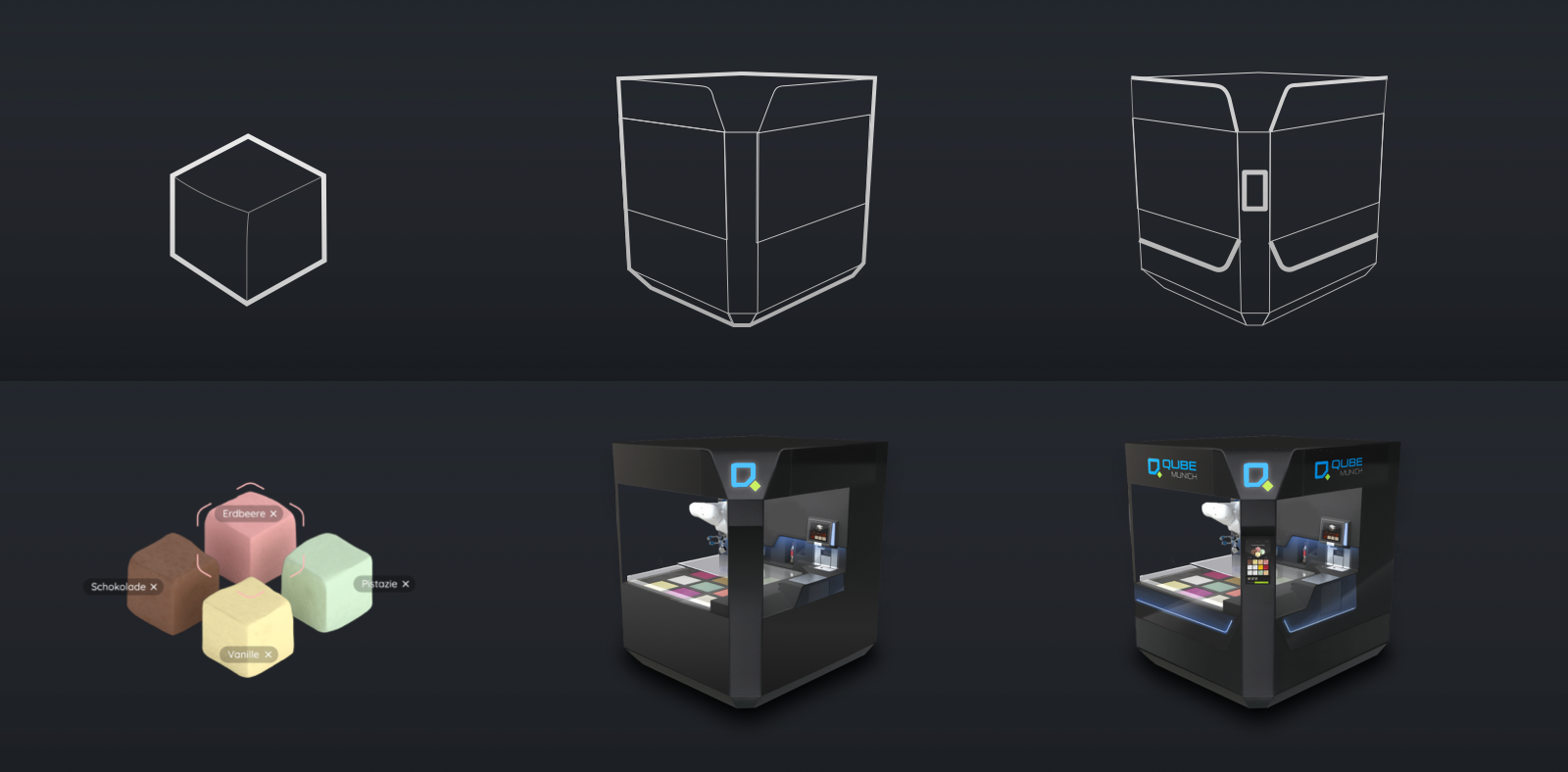
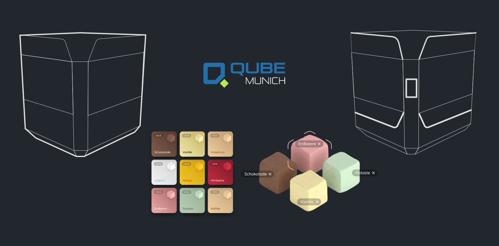
The robotics caterer should have a high experience factor, but users should also feel comfortable. With this in mind, we positioned the QUBE brand in a playful and unique way in the industrial and user interface design. For example, the brand's cube shape is taken up again in various design elements and a stage is set for the configuration of an ice cream cup. At the same time, we address the user directly and guide them through the ordering process with a high safety factor.

Guide through the ordering process with the HMI

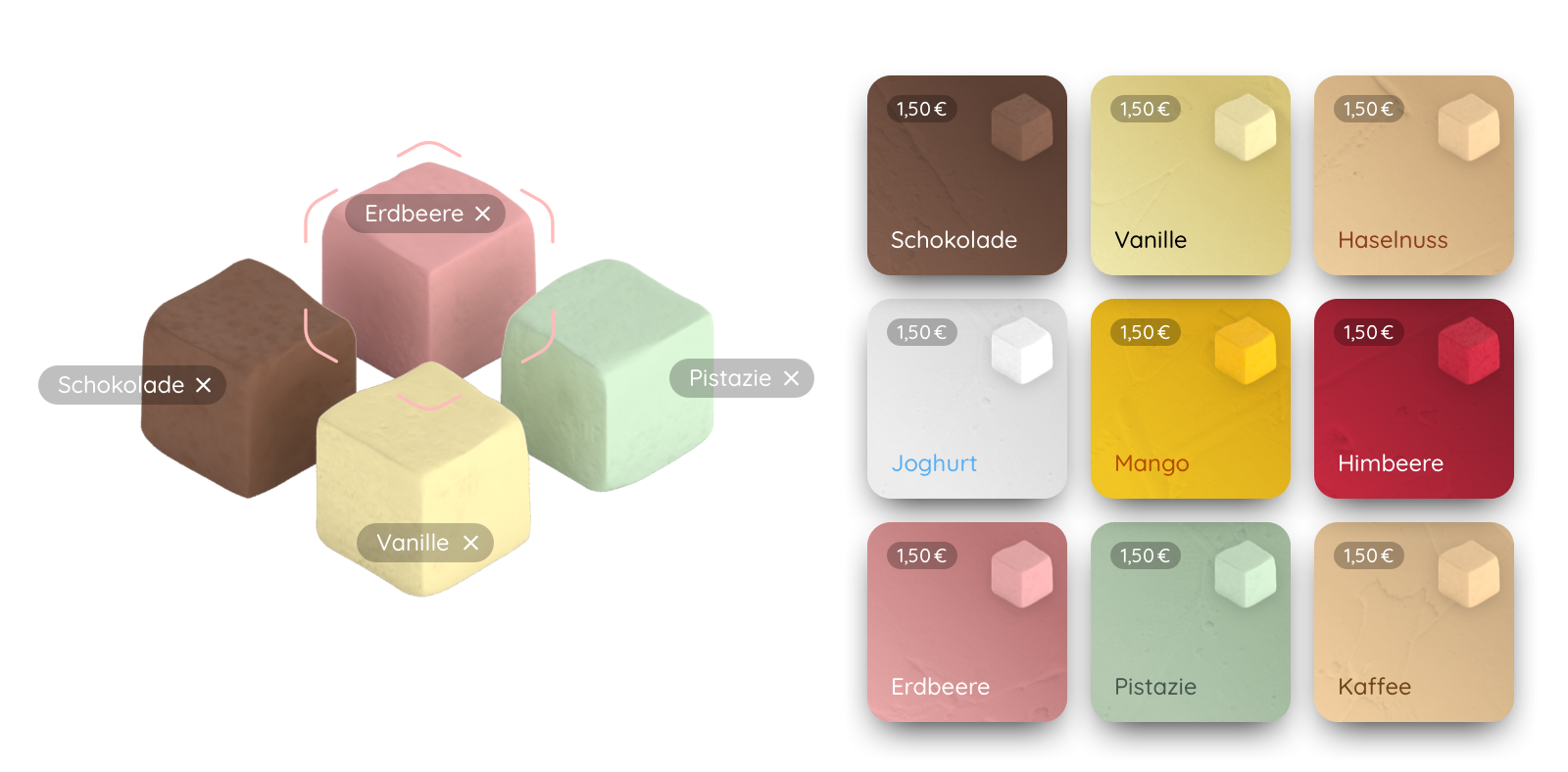
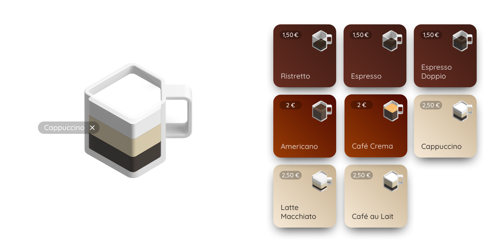
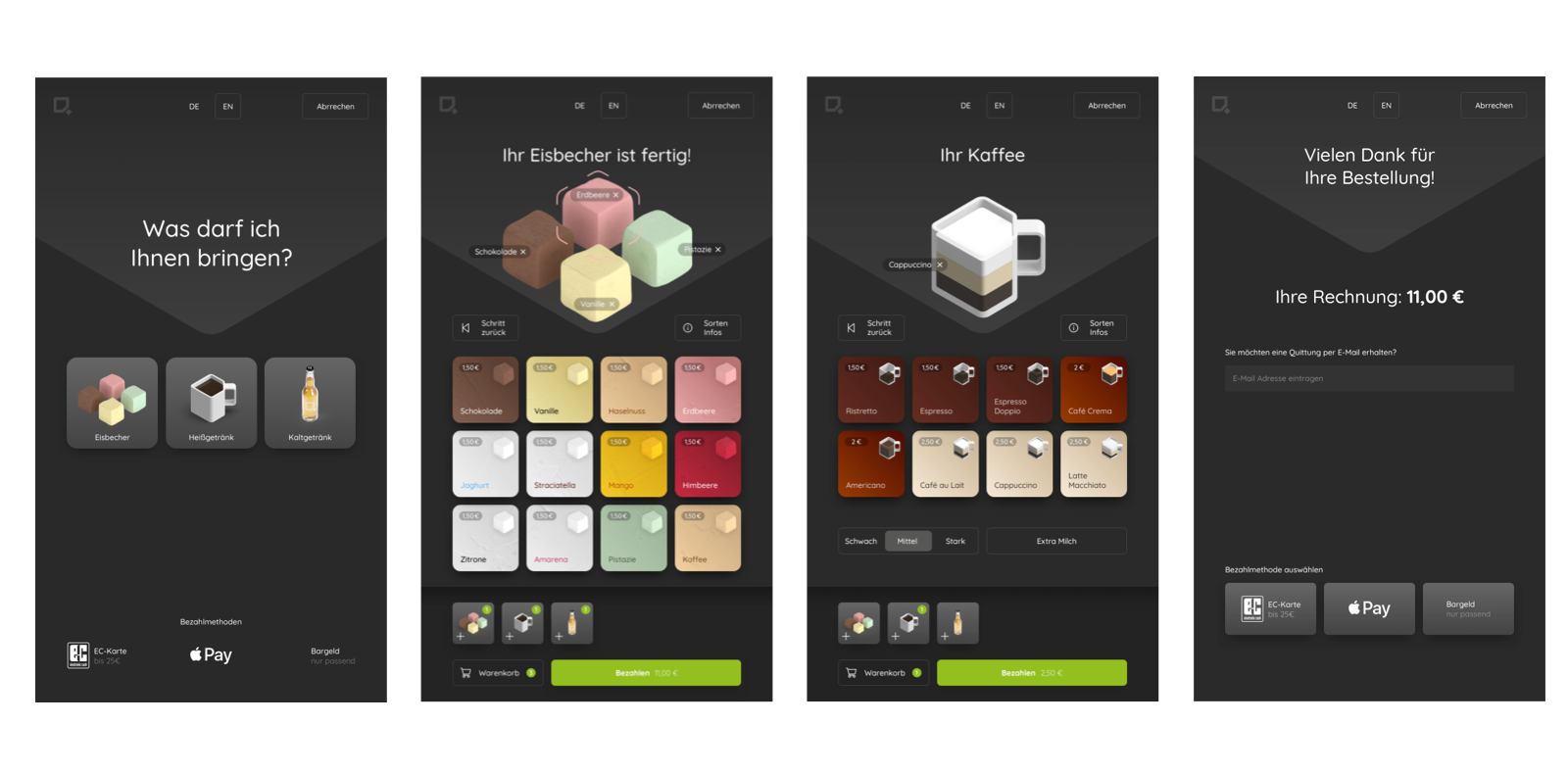
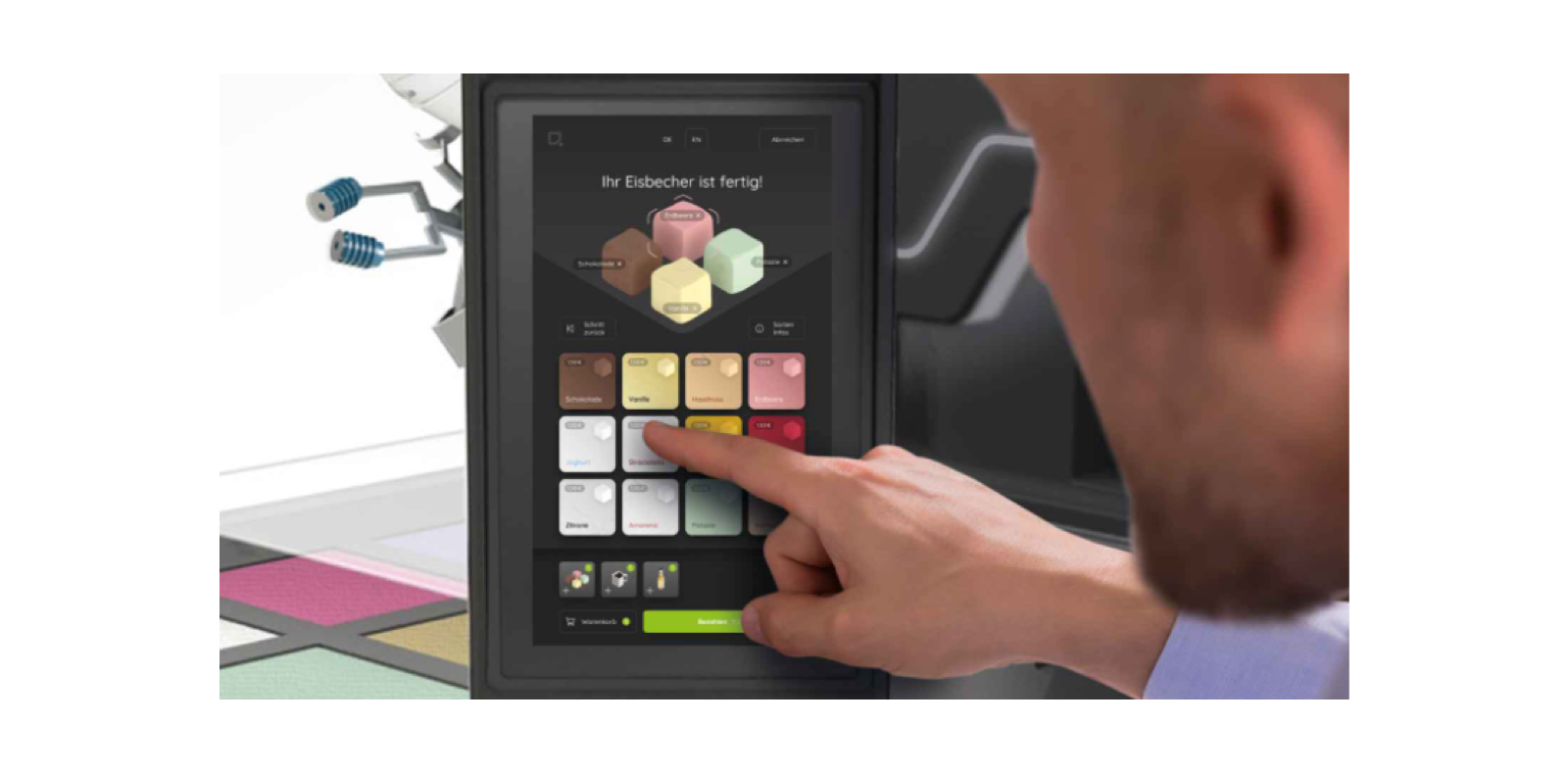
The HMI guides the user through the ordering and payment process. Products from different categories (ice cream, coffee, cold drinks) can be selected and put together. The user is addressed directly. To emphasize the experience character, a lot of space is given to putting together a cup of ice cream. The upper area of the HMI picks up on the base of a cube in the section, places a visual focus on the selected product and guides the user's gaze to the selection buttons. The design elements are reminiscent of the gaming world or product configurators. We have emphasized the Qube brand in the UI in a playful way. The cubic shape is consistently taken up in the product visualization.

An industrial design as a stage

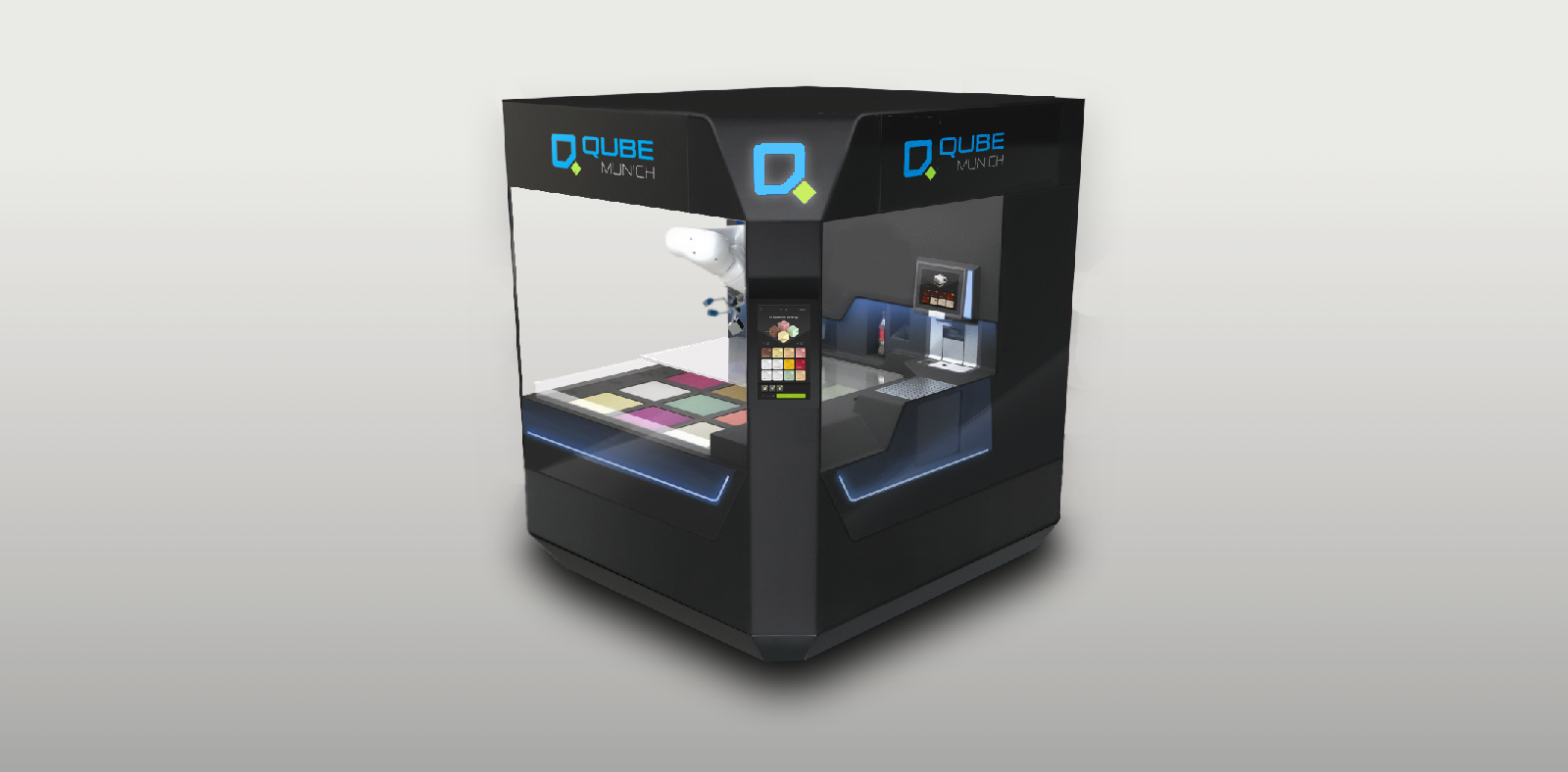
The beveled corners of the brand are used to guide the user. On one corner, the Plexiglas front is broken through by a bevel and the view is directed to the HMI. An illuminated strip on the outside guides the user from looking at the selection in the QUBE, to the order on the HMI and finally to the output flap. If required, advertising screens can be placed in the upper area. The beveled corners were also used to achieve a cubic appearance with a small footprint. In addition, the skirting has a contrasting color. The QUBE offers a large-area view of the ice cream flavors and the movements of the robot arm on three sides. The housing is kept dark to provide an optimal stage for the illuminated interior. Plexiglas elements on the outside give the Qube a high-quality appearance. Inside, stainless steel elements ensure high standards of hygiene.

Would you like to learn more about the project?

Tom Cadera

  • Management
  • UX & Usability Engineering
  • User Interface Design
  • Industrial Design

+49 931 460 66 0

cadera bei caderadesign punkt de