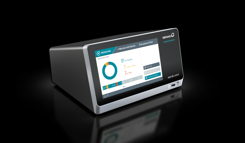
Successful industrial design for Viscom iX inspection systems

The iX7059 product family from Viscom AG offers high-precision X-ray inspection systems for quality assurance in PCB production. Our new industrial design for Viscom has helped to make the iX product family a great success.

We have developed an industrial (brand) design for Viscom that emphasizes the brand and has a strong impact, even when viewed from a distance. The developed design is transferable to other product families and repositions the Viscom quality brand. In several iterations, details were honed to the finest detail, such as the curvature of the sheet metal and the positioning of the Actyl glass milled parts as light guides.

Publication
Client
Viscom AG
INDUSTRY
Electronics production
DISCIPLINE
Industrial Design

Branding

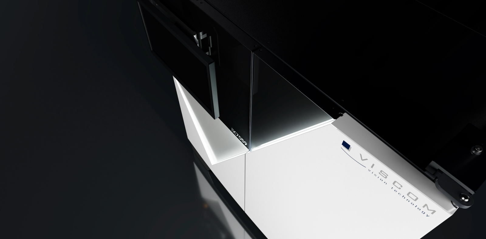
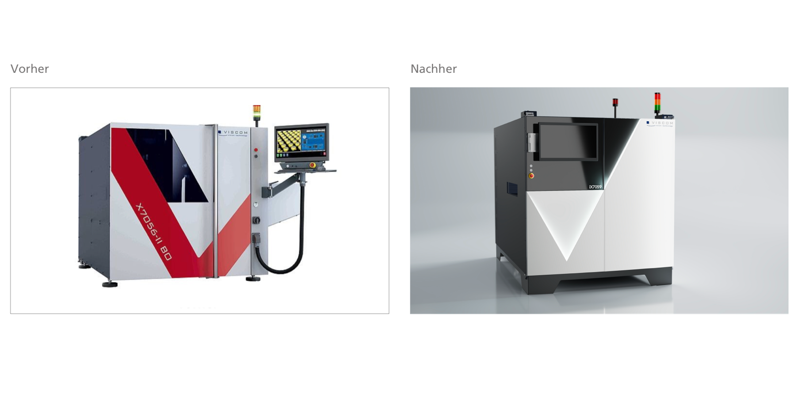
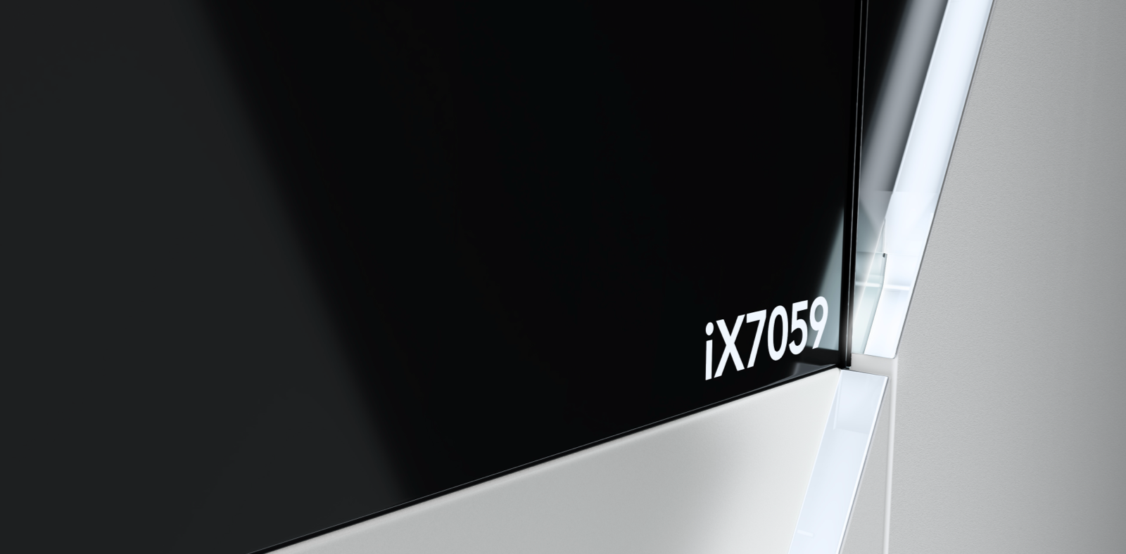
X-ray inspection technology is considered an extremely precise process, and Viscom's systems are among the highest quality on the market. This high standard is clearly reflected in the front of the iX7059 family. Light is not only used here as a metaphor for the inspection technology, but also serves to set the scene for the system in an impressive way. Clever lighting not only precisely displays the edge of the brand visual, but also creates a fascinating, style-defining light gradient on the surface behind it. The light-dark contrasts create a high-quality and impressive dramatic effect, which is given an additional friendly impression by the gentle curvature of the sheet metal cladding.

Particular attention was paid to the optimal positioning of the brand visual on the housing. This clever positioning not only creates a new look, but also an extremely fitting metaphor for a testing system: the checkmark, the sign for "everything is in order". The high quality of the system is thus impressively visualized on the front of the machine, while a light edge picks up on the brand visual and transforms it into a convincing checkmark.

Ergonomics

For a high-quality, seamless design, recessed recesses have been integrated into the light guide recess in an ergonomically favorable position. These are not only cost-saving, but also user-friendly.

We have also developed an ergonomic storage area for the keyboard that blends harmoniously into the design. The V-shape of the edge and the dark and light surfaces create striking lines, with the handle located in the cut edge. This physical operating element is thus strikingly emphasized and is easy and safe to reach.

Economy

Viscom's brand attributes are communicated and interpreted through the precise design of the front. The pricing of different models can be modulated through minimal adjustments in the production of the front. The differentiation between high-end and entry-level models enables an increase in return on investment (ROI).

Collaboration

We would like to thank our highly valued client, especially Dr. Heuser, who was very involved and for whom design as a corporate strategy is also an important concern.

Find out more on the Viscom website

Would you like to find out more about the project?

Tom Cadera

  • Management
  • UX & Usability Engineering
  • User Interface Design
  • Industrial Design

0931 460 66 0

cadera bei caderadesign punkt de